The challenge
Having worked with the founders of Walden O’Neill in a previous life, we were delighted to support the launch of the London-based Drupal agency by developing their logo, brand identity and core design language.
We achieved this by working with the partners to gain a deep understanding of their motivations and objectives, as well as the ethos for how they would do business. Various different iterations of the key elements such as fonts, logo and colour scheme were tested and refined until the final versions were agreed upon. The last thing we had to do was pull all of these together into a brand pack and guidelines which would ensure consistent long-term use.
The company’s name is made up of the maiden names of the founding partners’ mothers. Like everyone else, those at Walden O’Neill love their mums. The name illustrates the concept of partnership in the same sense a legal firm might. They also suggest a sense of heritage and stability, something the founding partners’ combined years in the digital industry provides to clients.
Established in 2015, Walden O’Neill is a Drupal consultancy focused on designing unrivalled experiences with impeccable technical execution. The founding partners worked at the forefront of digital for over 15 years, building leading digital propositions for Top 10 agencies across a variety of sectors. They found particular specialisms in financial services and healthcare.
Walden O’Neill believes that delivering impeccable quality at each individual stage of a project will result in something greater than the sum of its parts, and that team members are the ones with the experience and drive to deliver this quality. In this way, both the deliverables and the team that creates them are like links in a value chain – excellent alone, but exceptional and far stronger when working together. Chain links are a visual concept that stands to illustrate both.
What we did
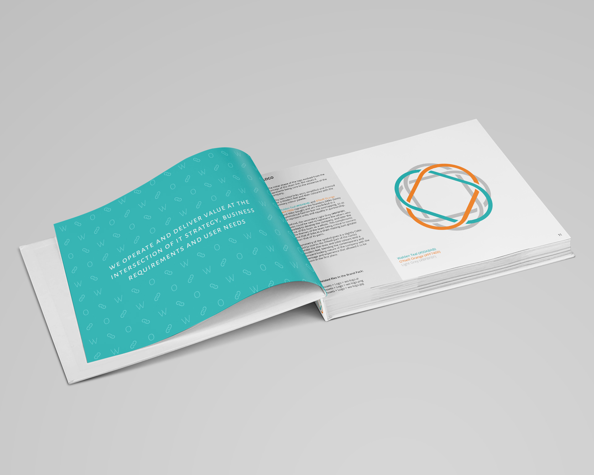
The initial shape of the logo evolved from the concept of the chain link; the values it represents being core to the existence of the company. The two initial links were simplified and thinned for a modern feel and then coloured with the primary colour palette. Walden Teal and O’Neill Orange represent the founders and are interlinked in a symmetrical fashion but not overlapping, so as to represent unity and equality in partnership.
Behind, the secondary Light Grey links represent the others who worked to develop the company, and later the rest of the team as a whole. The symmetry of the symbol gives it a slightly Celtic feel (a nod to the O’Neill part of the name) whilst the thin lines and solid colours lend a modern feel, blending the contemporary and forward-looking nature of the company with the heritage and experience that allowed it to be born in the first place.
The result
We still find looking back on our work for Walden O’Neill immensely satisfying. We feel it represents our commitment to branding being about more than just a logo and some colours, but as a living, breathing entity that has more to it than meets the eye. Strip back the facade and it has complexity, substance and longevity.