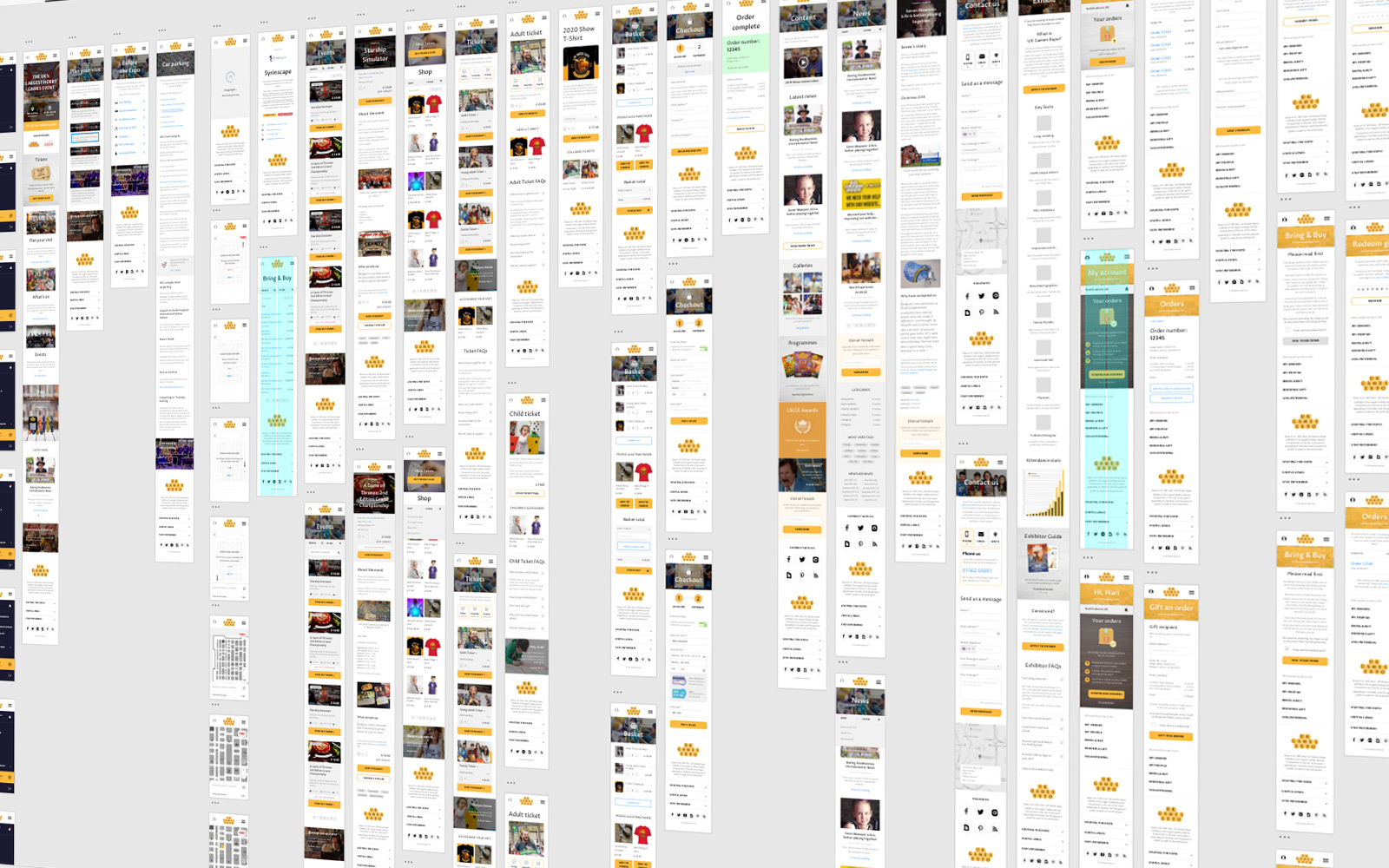
We’ve recently been working with a client to redesign their website, from the ground up, with a mobile-first user experience. It got us thinking and talking a lot about why a mobile-first approach might be the answer for a lot of companies.
The growth of mobile
First and foremost, we go where the users go. After all, you wouldn’t open a company profile on MySpace in this day and age! Even if it is still alive and (sort of) kicking.
Mobile devices now account for about half the web traffic worldwide. In the first quarter of 2019, mobile devices (excluding tablets) generated 48.71% of global website traffic (Statista).
Not designing your site with the largest audience device group in mind really doesn’t make a lot of sense.
Behaviour
If we think about ourselves, our families and especially ‘those darn kids’, smartphones and mobiles are really the only devices we tend not to leave behind. Some people actually suffer a form of separation anxiety when they leave their devices behind.
We rely on these devices as oracles of knowledge and convenience, and user patience is at an all-time low. Failing to optimise your website and service for them could instigate frustration and cause users to go elsewhere.
Regulation
Lawmakers eventually finally cottoned on to the fact that the internet is a massive thing, and as a result, new regulatory bodies are springing up all the time dictating how you can use data, and what you have to have on your website.
As a result of legislation like GDPR, websites are becoming more complex and aspects of design are increasingly dictated by regulatory bodies. Not much attention has been paid to how to make these things user-friendly, however, resulting in mobile horror shows that might look a little like this:

Can you spot the actual content?
Going mobile-first focuses consideration on the impact of such regulation for users, and the formulation of possible solutions that don’t compromise your site.
What’s really important
The reduced screen size of smartphone devices over traditional computers also forces you to seriously think about your websites purpose and Minimum Viable Product (MVP), and prioritise accordingly. This focus on the necessary can also make the tablet and desktop views even better, as they get this plus extras.
Bottom line
Ultimately, we think a mobile-first approach ensures that the majority of your users get the experience they need in terms of:
- Speed
- Layout
- Functionality
- Device relevant inputs and contextual interfaces
As ever, the world is changing and we need to change with it.
We can help you to plan, organise, design and build a website that is optimised for mobile users first and foremost, without compromising the experience of desktop and tablet users.
Speak to us today about mobile user experience, and how to create a great mobile-first website.