Welcome to our simple and informative guide on how to handle images in responsive web design. If you’ve ever wondered why your images don’t look quite right on different devices or browsers, don’t worry. We get asked this question a lot, so we created this post as a quick and helpful guide for our clients, and for you.
Let’s dive into the essentials of managing images effectively in the digital world.
Cropping for consistency
When creating a responsive website, your designer or developer will often have to crop images to maintain a consistent look across all devices. This helps in aligning images aesthetically with your website’s layout. It does mean, however, than your image may be cropped at different resolutions, so it is important to consider this when choosing an image to use.
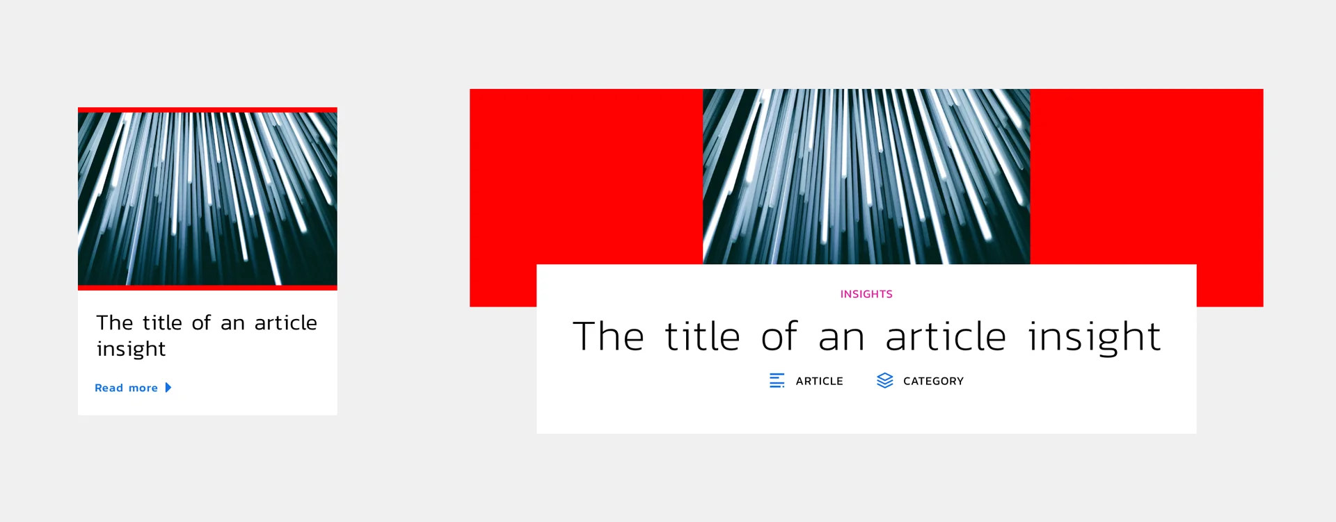
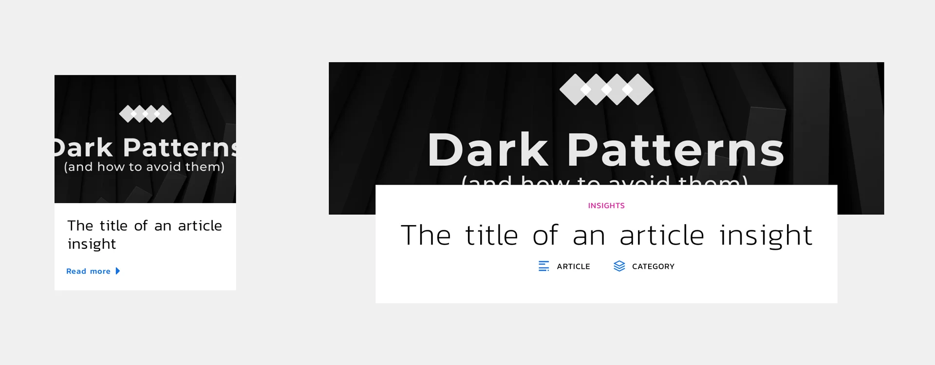
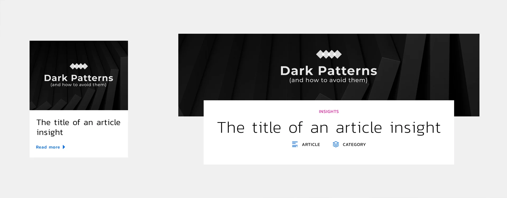
For example, when choosing images for your blog, we might use a featured image to illustrate the blog post’s content. This same image would then be used to showcase the post both in the list of posts and at the top of the post itself.
As the two image areas are different shapes, and we want to use the same image for both spaces, we will have to crop the image at the sides in the grid, and on the top and bottom for the blog post header, with the cropped-off parts of the image shown below with transparency:
This highlights how using an image that doesn’t have any particular area of focus might work well in this context. If we didn’t crop it and instead forced it to fit within the shape (without distorting it), this would introduce what is called a ‘letterbox’ or ‘curtains’ around the image, represented below in red.
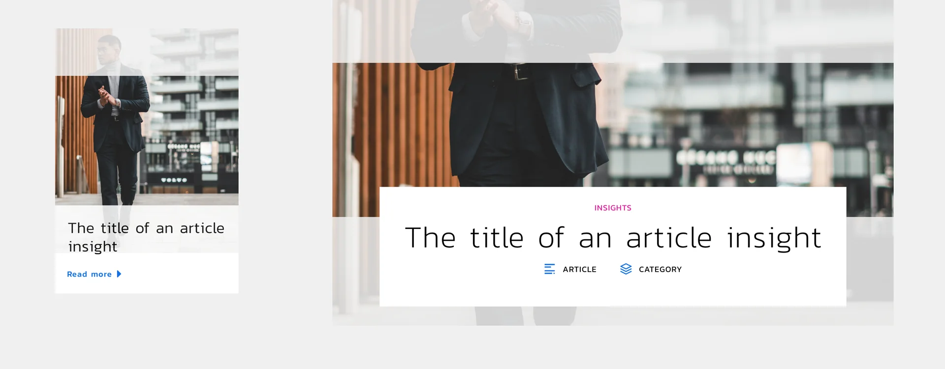
However, an image that has important information in different areas might not work as well. For example, the image below is portrait (tall). When we try and use it in a landscape (wide) setting, it crops off important detail, like the man’s face:
We can try and move/crop the image to better align with the specific elements we want to showcase in the image, but as the wider image is so much wider than the original, the overall image will still be zoomed in.
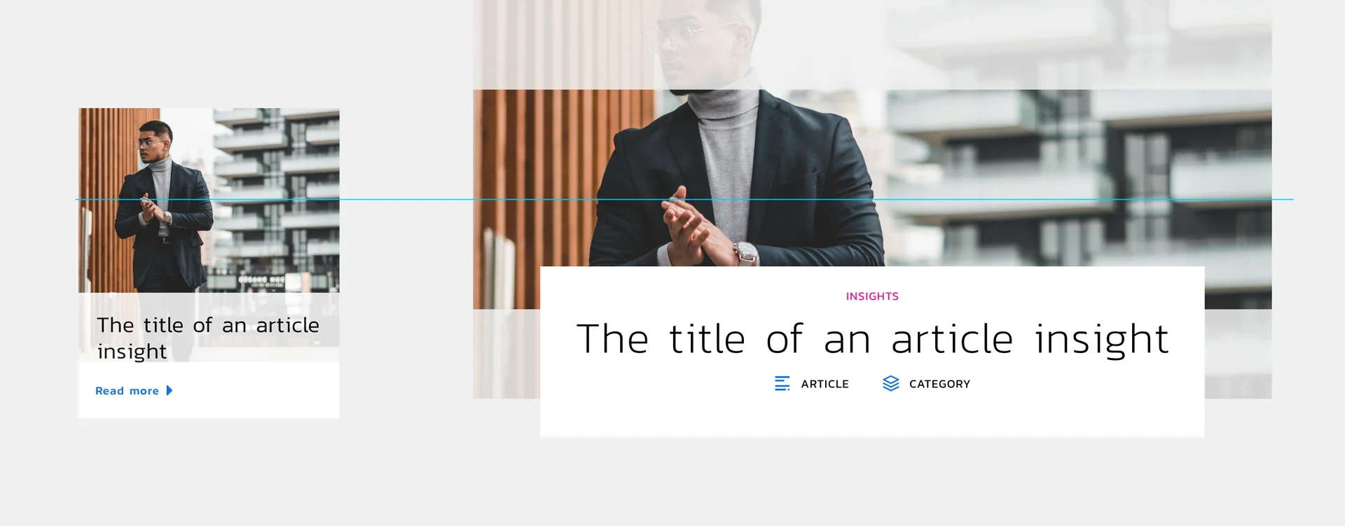
As most images will be centred both horizontally and vertically within a shape, we may still end up with a cropped image. The blue line below illustrates the vertical centre of the image:
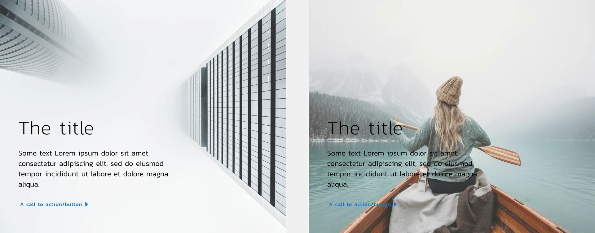
In order to take advantage of templating (whereby all your posts and layouts look as good and consistent as possible) our images must also fit into the rules of the templates. This goes to show how important it is to run through an editorial process and choose the right image for your page, post or blog.
Choosing the right image
Considering the above examples, it is critical that you choose an image that has the potential to work all the different areas of your site in which it might appear.
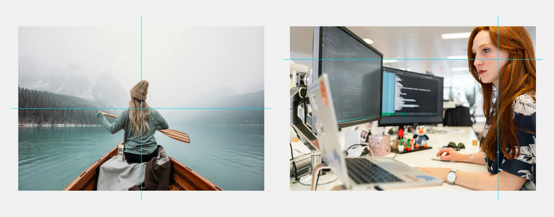
Consider the space
If, like the examples above, your website displays the same image in square, portrait and/or landscape areas, then the area of focus for the image needs to be in the centre. Using the example of the following two images, you can see how the area of interest (represented by the intersection of the blue lines) is in the middle of one, and the top-right corner of the other:
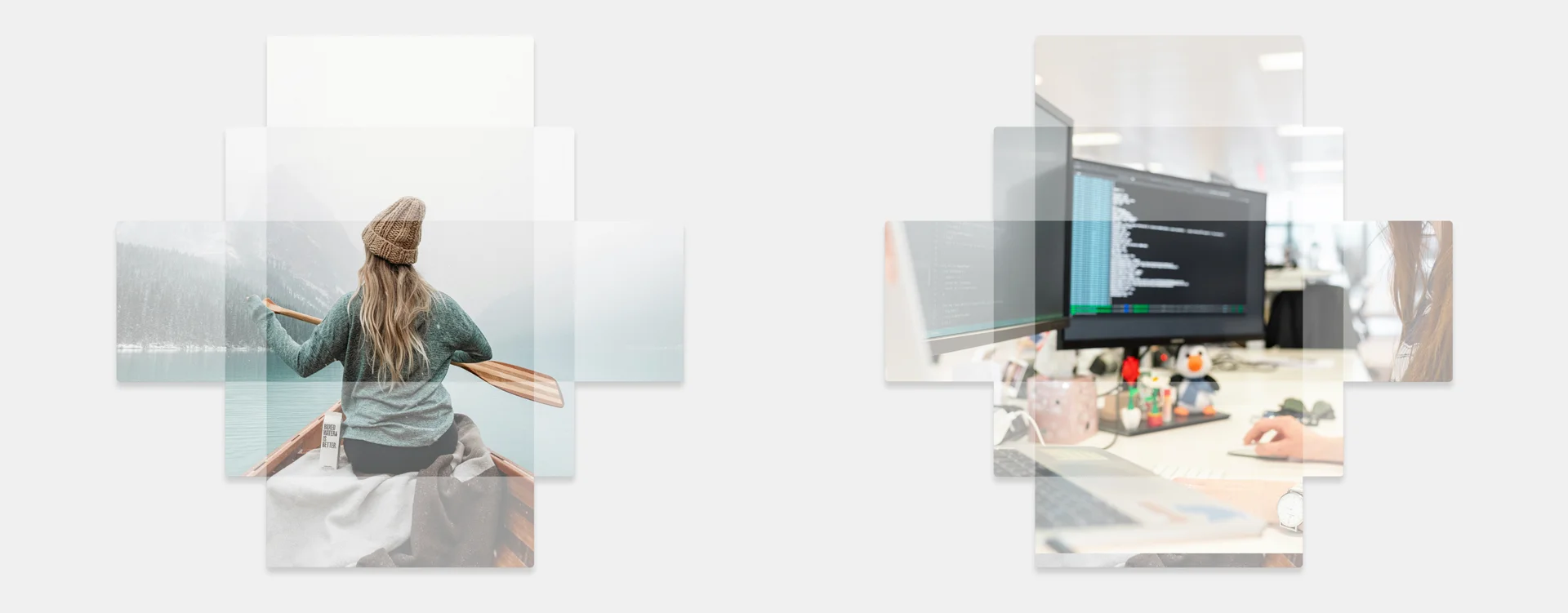
As such, when you try and use these images in different areas that might be taller or wider than one another, you see how the image is cropped – to good effect in one example, and poor effect in the other:
As the image areas usually focus on the centre, the second image of the woman at the computer loses the key (in-focus) feature every time – the face. Instead, the blurry centre of the image is displayed prominently.
The website has to use all images in the same way to prevent you having to create custom code every time you add content. This is restrictive, but it is far easier to editorialise image content than create new code each time you post a new blog article.
Some images make use of the negative (empty) space in images to good effect – if (for example) text is displayed by the website to the left side of an image, then the left had side needs to be empty enough that the text is uninterrupted by the image detail, and the main detail is on the right.
If we use a different image that has detail in the same part of the image that will interfere with the text, it won’t be possible to read the text easily:
⚠️ Avoid text in images
When you put text inside an image, you lose control over how that text displays on different screen sizes. An image that looks good on a desktop might crop awkwardly on a mobile device, cutting off your important text.
If you absolutely have to include text as part of an image, you should first establish that it has sufficient negative space around it that it will not be cropped when used in different areas of your site.
It may be necessary to create different versions and different crops of the image to display accurately in different parts of your site:
The best formats
When it comes to displaying an image on your site, it is important to choose the right format.
Ever noticed how a beautiful image on your laptop can look blurry on your phone, or vice versa? That’s because images need to balance three key aspects: size, quality, and format.
Smaller images tend load faster, which is crucial for keeping your website speedy, especially on mobile devices. However, if an image is too small in file size, it might lose its clarity and sharpness.
The dimensions (width and height) of an image determine how well it fits into different parts of your website. Too large, and it takes ages to load; too small, and it looks pixelated.
The formats is how the image is encoded. There are different options for different applications:
- WebP is a newer format that provides high quality with smaller file sizes through better compression. However, it’s not supported by 100% of browsers yet, so you may wish to consider your audience and the likelihood that they will be using older browsers.
- JPG/JPEG is great for photographs. It keeps file sizes small but can lose some quality.
- PNG is best for images with a transparency layer. This format offers higher quality but with larger file sizes.
Recommended settings
So the million-pound question – what do you do?
As we’ve shown above, images can be highly contextual, but we do have some guidelines we tend to live by.
Any image that is going to be used in a header image will need to be large enough to look good at the maximum width of the viewport on most monitors. As above, we have to balance out quality, file size and dimensions. We typically recommend that images such as this are:
- At least 1920px wide on their longest edge, and tall enough to fit in the image area on the screen without becoming zoomed in (in most cases, this is probably ~550px minimum)
- No larger than 500KB (0.5MB in size)
- In JPEG, PNG or WebP format as appropriate
Remember the background
While PNG images are fantastic for their transparency capabilities, be cautious when placing them on backgrounds with inadequate contrast.
Transparency in PNGs can lead to visual issues where important parts of the image blend into the background, making them hard to see or understand. For example, a light-colored PNG image on a white background might render parts of the image invisible or difficult to discern.
Always ensure there’s sufficient contrast between the image and its background to maintain clarity and visual effectiveness. This is especially vital in responsive design, where backgrounds may change or shift across different devices.
Useful tools
If you’re wondering how you can achieve all the different cropping or encoding actions described above, there are some great tools available (both paid and free) that can help:
- Adobe Photoshop (£££) – the gold standard of image editing, that can do anything you might need.
- GIMP (Free) – The GNU Image Manipulation Program – a free, open-source equivalent of Adobe Photoshop. It’s free and fully featured, but can be .a bit more of a learning curve.
- Canva (Freemium) – A mostly free-to-use online graphic design tool for social media posts, presentations, posters, videos, logos and more. Some features require a subscription.
- Squoosh (Free) – A really neat web-based tool that resizes and compresses images using a variety of different libraries.
In conclusion
Handling images in responsive web design is a bit like fitting puzzle pieces together. You need to consider the size, quality, and format of your images, avoid embedding text in them, crop for consistency, and ensure they don’t distort your design.
Remember, the goal is to provide a visually appealing and functional experience to users, regardless of the device they’re using. Keep experimenting and you’ll find the perfect balance for your images!
Feel free to share this guide with anyone who might find it helpful, and do reach out to us if you think we can help to create an amazing web solution for you.