The challenge
Every now and then, a project comes along that’s doing things no one else is doing. These projects are always a joy to work on because instead of taking inspiration from existing mental models, established UI conventions and what the competition is doing, we get to flex our UX and creative muscles. It is imperative that something users haven’t seen before is both distinct, but familiar enough to use. It’s an interesting line to walk.
ProPix is such an example. Currently, if you want to add photos to your phone contacts, you have to go to each contact manually and complete several steps/taps to add an image. More than half of the people we talked to have over 50 contacts on their phones, and a significant majority have well over 100. Adding contacts to all of them could take a while! ProPix answers this challenge by providing galleries of beautiful images (PixPacks) that you can download and add to all the contacts on your phone. It solves a technical limitation, but at the same time is truly breaking new ground with a direct-to-smartphone marketing model that could make your favourite brands’ images available anytime – present with every call or text.
Anyone in the tech world will know that getting a product to market is complicated, however. Especially if you want to do things properly. ProPix initially released the first version of their app to prove the concept, get initial feedback and start to build a user base. While successful for this, the new concept meant the app itself was in need of visual and User Experience enhancements if it was going to scale as desired. Having worked for ProPix extensively over the last two years on web, media and digital challenges, we were approached to create the UI for version 2.
Click to jump to a section
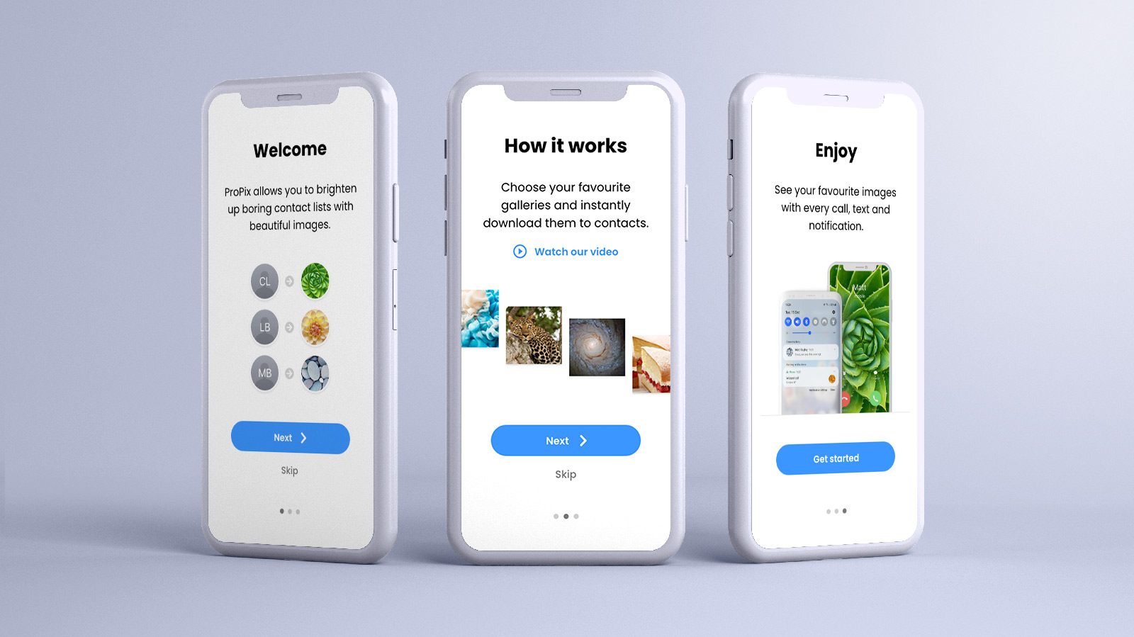
Orienting users
Most mobile apps now explain what the app is and how to use it quickly, usually when it is first launched. Even apps that are familiar and offer well-understood functionality offer this, as it helps users with lower technical sophistication to get their bearings, and reinforces this knowledge for everyone else. The original ProPix app dropped the user right into a single binary choice – Shop or My PixPacks (the latter of which wouldn’t do anything for a first time user). Our user research indicated that more orientation was required for all users, something especially critical for an app that no one has quite seen before.
We built two tutorials – one to orient users to the app, seen by everyone on the first launch, and a second elective tutorial that showed users how to go about downloading their first PixPack, if they hadn’t already started exploring the simple options available.
After this, users were directed to the best starting point for a first time user, the wide array of beautiful images available to them.
Establishing the transactional nature of ProPix
First impressions really matter. With most websites, we see that you have about 5 seconds to make an impact with users and get them to consider what their next step is.
Although the concept of ProPix is new, we looked for parallels anyway to see if there were any processes that people would be familiar with to help ground the experience.
Anyone with a smartphone running iOS or Android uses their respective app stores to download apps to their phones. The PixPacks that ProPix offers are similar, and it was important to establish the price of a PixPack, along with the multiple routes a user could take to purchase one at various stages of their exploration.
Furthermore, we recommended a free gallery, or ‘MixPack’, so that users had the chance to ‘try before they buy’ and establish that the functionality was something worth paying for.
Finally, categories helped to group common themes and values together and always reinforced the purchasing options.
Preserving user choice
By this point we had identified that the majority of smartphone users have dozens or even hundreds of contacts in their phone. Most of these typically wouldn’t have contact photos either. However, some of us have taken the time to add photos of key people – parents, significant others, and close family/friends for example. It’s nice to see photos of the people we love appear when they call, so it was important to offer the user an option to preserve certain contact photos, rather than overwriting them.
The locking feature was built into the first version of the app, but it wasn’t always completely apparent that the lock was preserving the contact photo. After some testing, we recommended the app pull in existing contacts from the phone so users could see the options, and get visual reinforcement that when they locked a contact, their existing image would remain untouched.
Making the most of images
Images are the heart of ProPix, so our app designs tries to make the most of these and let the images do the heavy lifting. We use images to convey meaning wherever possible, supported by only minimal text or iconography. The images are also allowed to occupy as much screen space as possible, and we also tried to use a minimalist colour scheme, so the images could stand out while calls to action remained clear.
Building a design language
Having already worked on the ProPix website, and starting to think about the usability of the back-end system that runs the ProPix App, we had begun to build a design language for ProPix interfaces that we wanted to keep as consistent as possible between properties.
Interactive prototyping
Usually when we work with new interfaces, our user testing is conducted using wireframes. However, the visual polish of the UI was just as important to setting the right impression with ProPix, so we built an interactive prototype using Adobe XD that could be loaded up in user testing sessions. Users could tap, swipe and conduct selected tasks in almost the same way as using the final app, so we could observe and gather feedback on specific functions, journeys and UI elements.
Feedback was then worked into the final design tweaks in order to cater for the widest possible variety of audiences. After all, anyone with a smartphone could be a ProPix user.
Developer handover
We don’t build a lot of mobile apps ourselves, but we do help people create great mobile web and app experiences that people will love to use. That’s why we included a breakdown of assets and design rationale to help the third-party app developers do what they do best – make it all work.
Before and after
Ultimately, we think our efforts made a massive difference to the app. It created a version that is not only beautiful to look at, but easy for users to get their heads around and hopefully continue using. It also looks the part as ProPix continues to grow.
The result
Having said that, while it’s good for us to be proud of the work we do, the real proof comes from a happy client.
Why not try ProPix for yourself? See beautiful images every time your phone rings, or you get a notification. ProPix is available for download on both iOS and Android, and this new version of the app should be available from August 2021.